Breakpoint media-queries
插件截图
插件概述
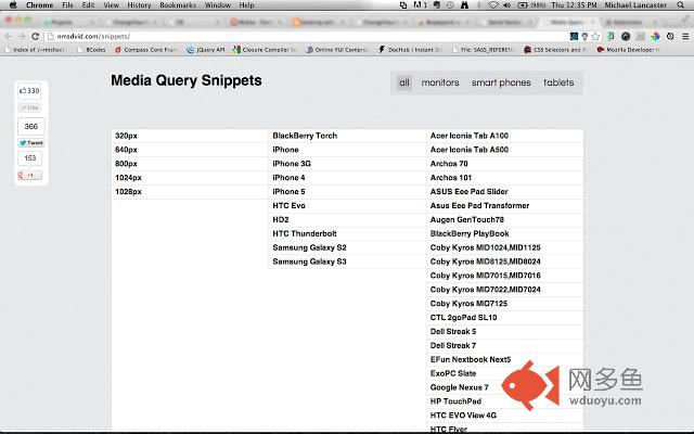
Generate media-queries, show screen sizes width and link to a list of media-queries snippets.插件详情
The extension generates media-queries for using max-width, helps you see the current screen size width and link you to a list of media-queries snippets.1. Add the extension to your Google Chrome browser.
2. Start resize your window and see where your content are breaking.
3. Click into the Breakpoint icon.
4. Click "generate code".
5. Copy the code generated.
6. Past into your style sheets.
Pretty simple and useful.
Version 1.0:
- removed Jquery
- re-built with vanilla javascript
Version 0.7:
- Design improvements.
Version 0.6:
- Design improvements.
Version 0.5:
- Added external link to media-queries snippets with a bunch of devices.
- Design improvements.
Version 0.4:
- update from min-width to max-width.
Version 0.3:
- icon updated.
Credits:
Thanks to David Nemes for the Media-Queries Snippets.
其他信息
官方唯一标识:lgldclhg****************mjlhjlng
官方最后更新日期:2013年6月5日
分类:开发者工具
大小:14.23KiB
版本:1.2
语言:English (United States)
提供方:none
星级:5
插件下载
| 下载链接一 下载链接二 |
| Chrome插件离线安装教程 |
温馨提示
本站中的部份内容来源网络和网友发布,纯属个人收集并供大家交流学习参考之用,版权归版权原作者所有。
如果您发现网站上有侵犯您的知识产权的作品,请与我们取得联系,我们会及时修改或删除。
如果您觉得网多鱼对您有帮助,欢迎收藏我们 Ctrl+D。