Mobile/Responsive Web Design Tester
插件截图
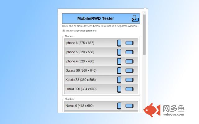
插件概述
Test responsive web designs or mobile pages that detect specific user agents. Test multiple devices at the same time!插件详情
The Mobile/Responsive Web Design Tester extension allows Web Designers and Developers to test their web pages against common mobile, phablet and tablet devices by emulating the user agent and screen resolution. Excellent for testing responsive web designs. Easily switch between portrait and landscape mode and test multiple mobile device's at the same time!Very helpful when your site is in development and testing on actual devices can be difficult.
Although using feature detection is best practice, there are still situations that come up in which you need to detect a devices user agent. The Mobile/Responsive Web Design Tester is unique in that it not only emulates device resolution, but also the device's user agent.
** Version 2.1 (7/30/2015)
- Added a couple new devices
** Version 2.0 (4/5/2015) **
- Added option for enabling/disabling swipe imitation
- Added support for mouse wheel scrolling while in swipe imitation mode
- Added portrait and landscape buttons to make switching between the two modes easier
** Version 1.9 (11/20/2014) **
- Added back button
** Version 1.8 (11/19/2014) **
- Bug fix in scrolling
** Version 1.7 (11/18/2014) **
- Implemented better scrolling
** Version 1.5 (11/16/2014) **
- Updated/added new devices
- Updated layout
- Added donate button
- Didn't change anything, but mouse scroll worked in this round of development. Hopefully it works for everyone in production. We'll see.
- Corrected bug that occurred on https pages.
其他信息
官方唯一标识:elmekoko****************eggnbelo
官方最后更新日期:2015年9月27日
分类:开发者工具
大小:2.55MiB
版本:2.2
语言:English (United States)
提供方:none
星级:4
插件下载
| 下载链接一 下载链接二 |
| Chrome插件离线安装教程 |
温馨提示
本站中的部份内容来源网络和网友发布,纯属个人收集并供大家交流学习参考之用,版权归版权原作者所有。
如果您发现网站上有侵犯您的知识产权的作品,请与我们取得联系,我们会及时修改或删除。
如果您觉得网多鱼对您有帮助,欢迎收藏我们 Ctrl+D。